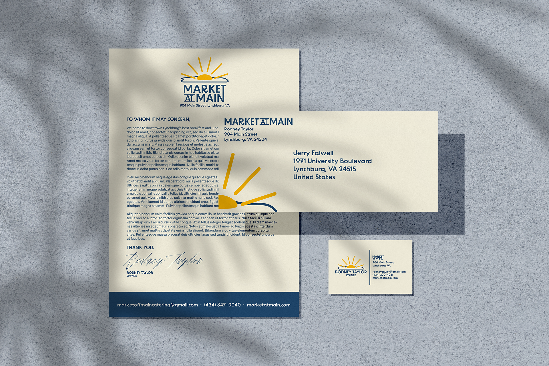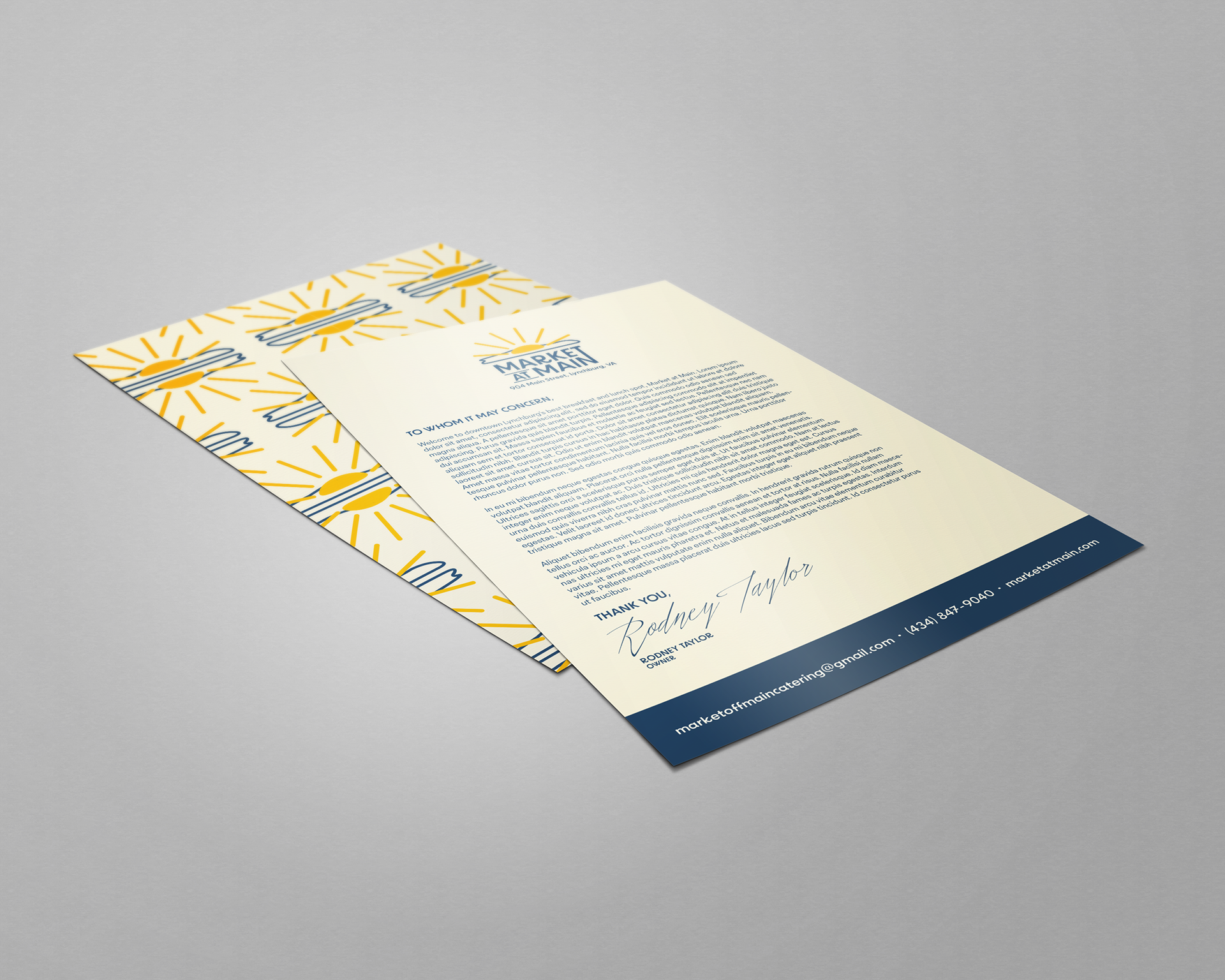
The prompt for this project was to create a new identity portfolio for a local restaurant. This included a logo in black and white and in color, a letterhead, an envelope, and a business card. With the logo, I picked Market at Main, a local breakfast and lunch spot. I wanted to go with something that fit the breakfast and lunch menu of the restaurant while remaining somewhat classy and modern. After sketching multiple logo ideas, I ended up settling on an egg where the yolk was a sunrise. The egg was for the menu and the sunrise was was to symbolize the new day. With this, I could have the egg design as a supporting factor on different products so it did not necessarily need the Market at Main text on everything.
MOCKUPS