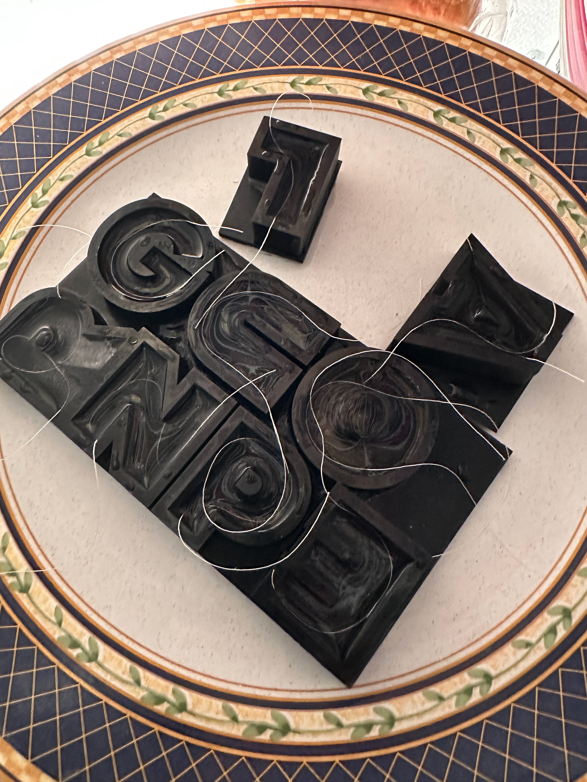
For this project, my goal was to create an informational advertisement for a workshop, class, or event. The title of the event on the advertisement had to be made out of physically created letterforms. When starting with the project, I was inspired to create 3D-printed ice molds made of resin in the shape of letters spelling out "Polar Plunge." I was going to create ice letters to advertise an ice bath informational session held by an Icelandic tourism company.
But, I ran into a problem of not being able to extract the ice from the molds. My first test was using force and leverage to get them out, but they just cracked. Then, I left them to melt for a bit, but the letters still wouldn't come out. If they did, they would be unusably miniscule. Then, I used non-stick baking spray, strings to pull, and wax paper but none of them worked. After multiple test runs and a week of trial and error, I had only three days until the project was due with no avenues left.
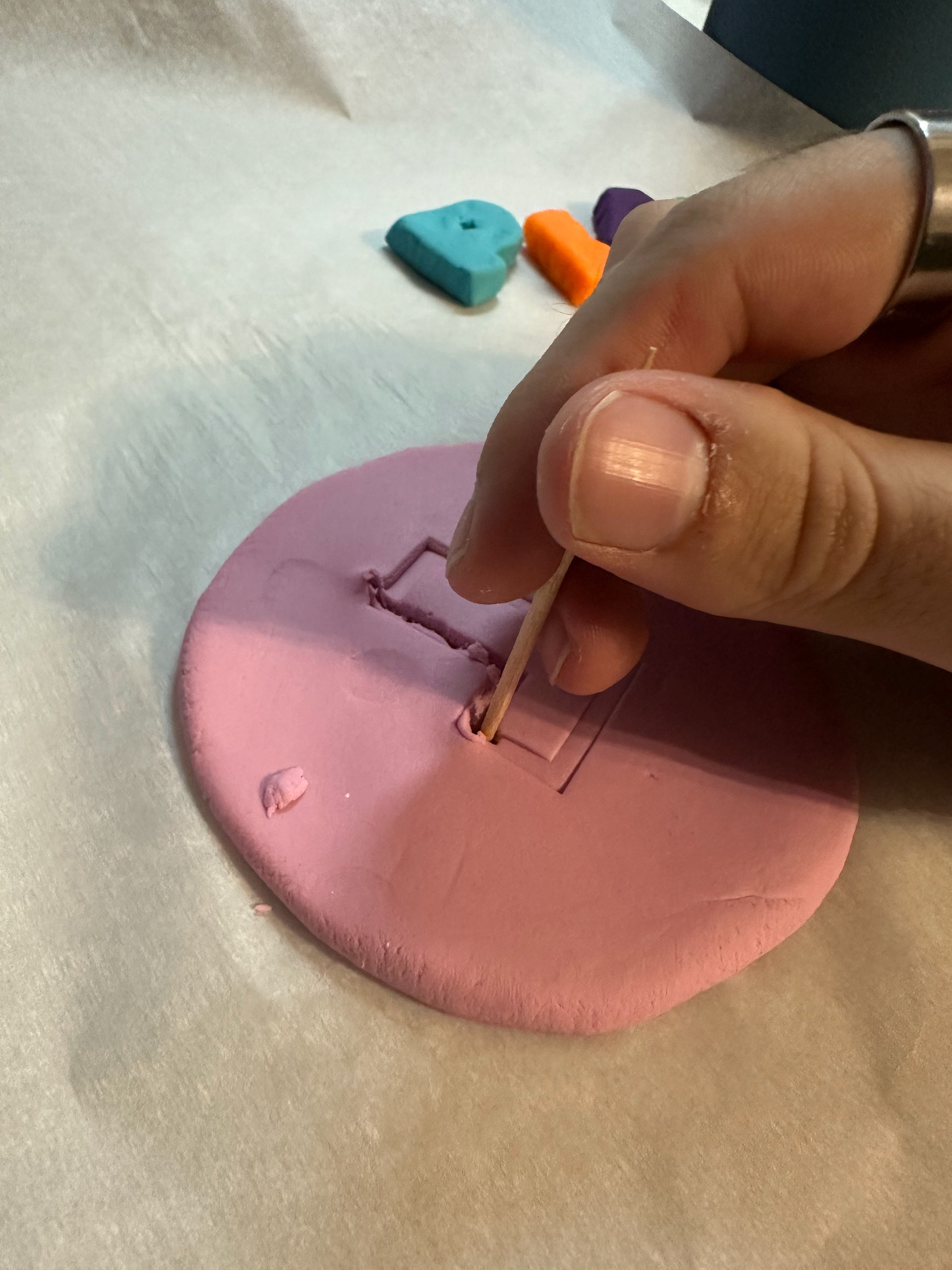
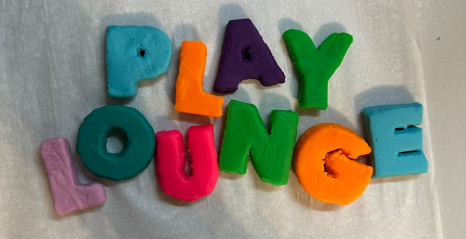
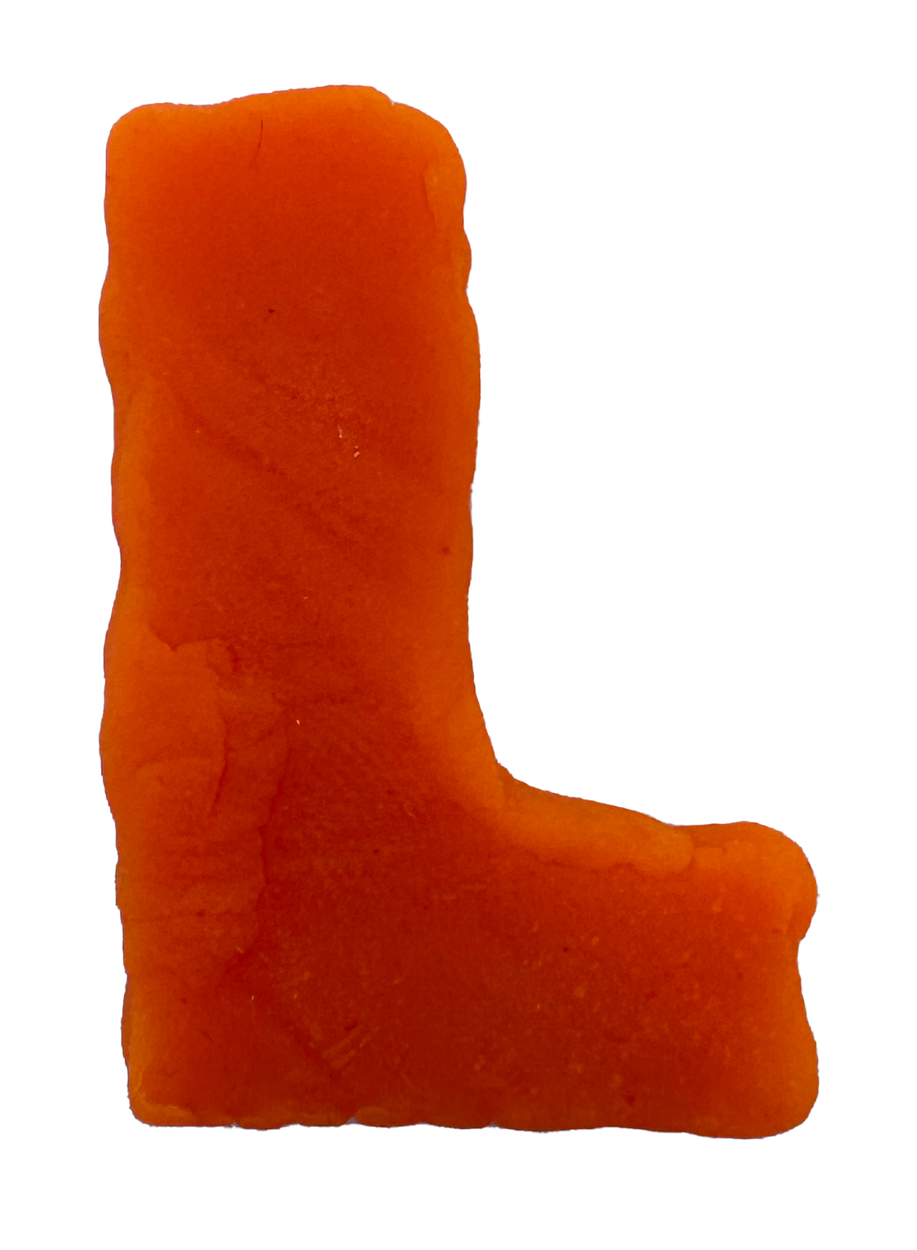
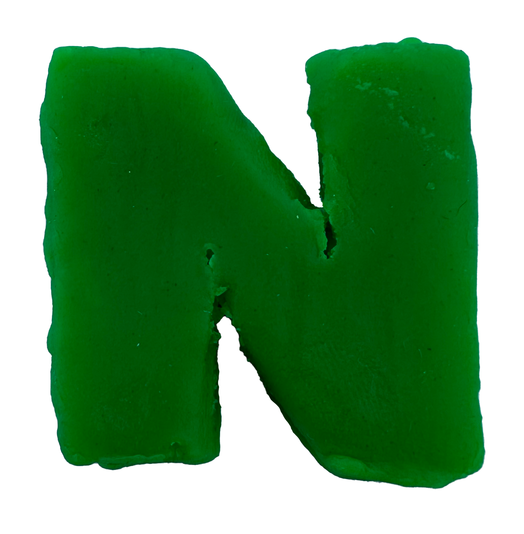
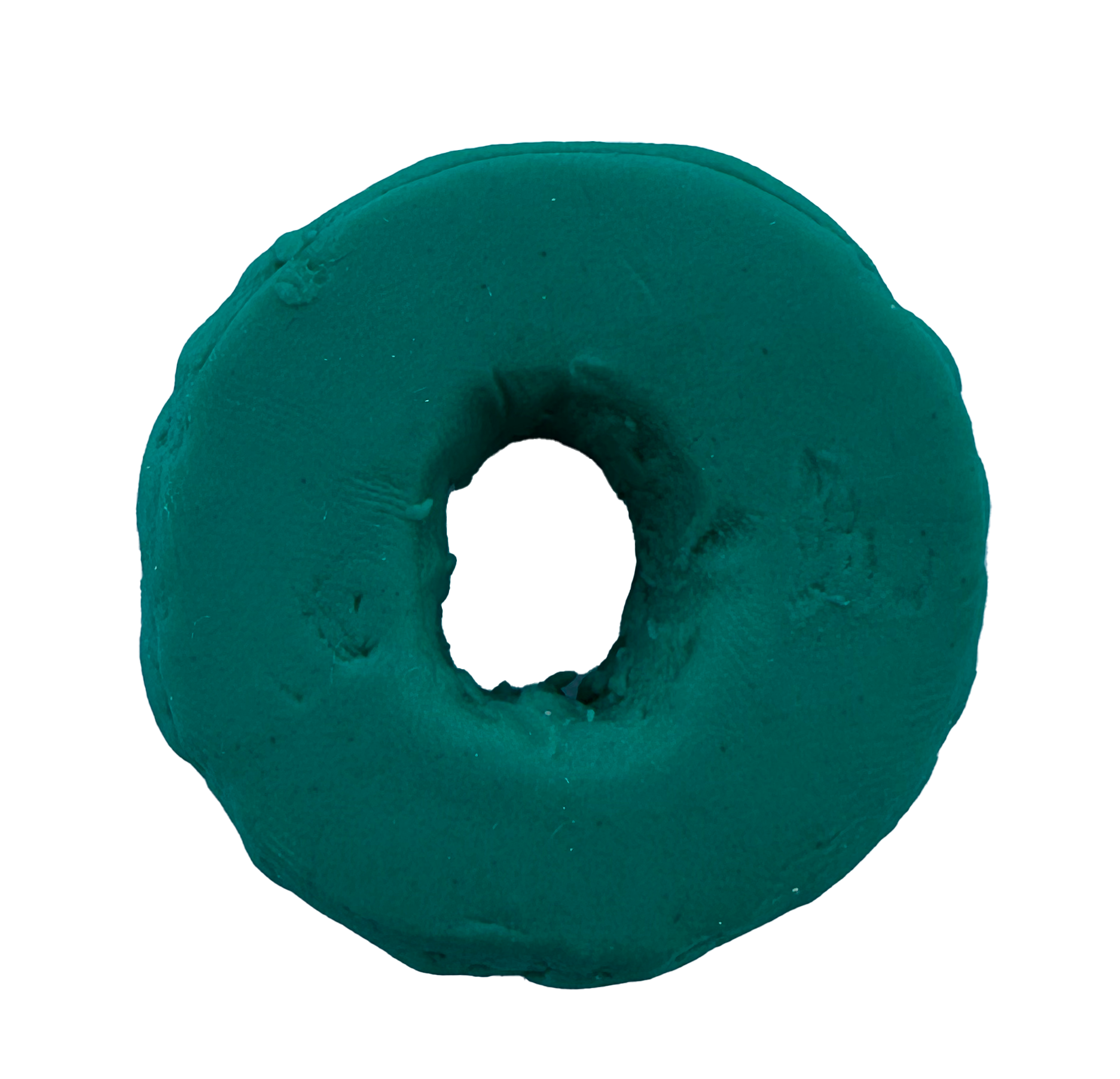
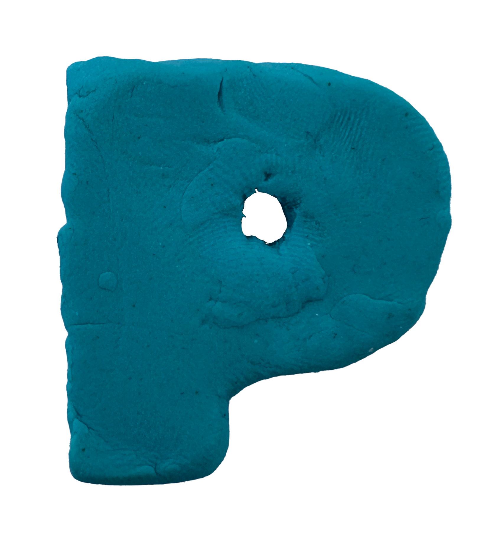
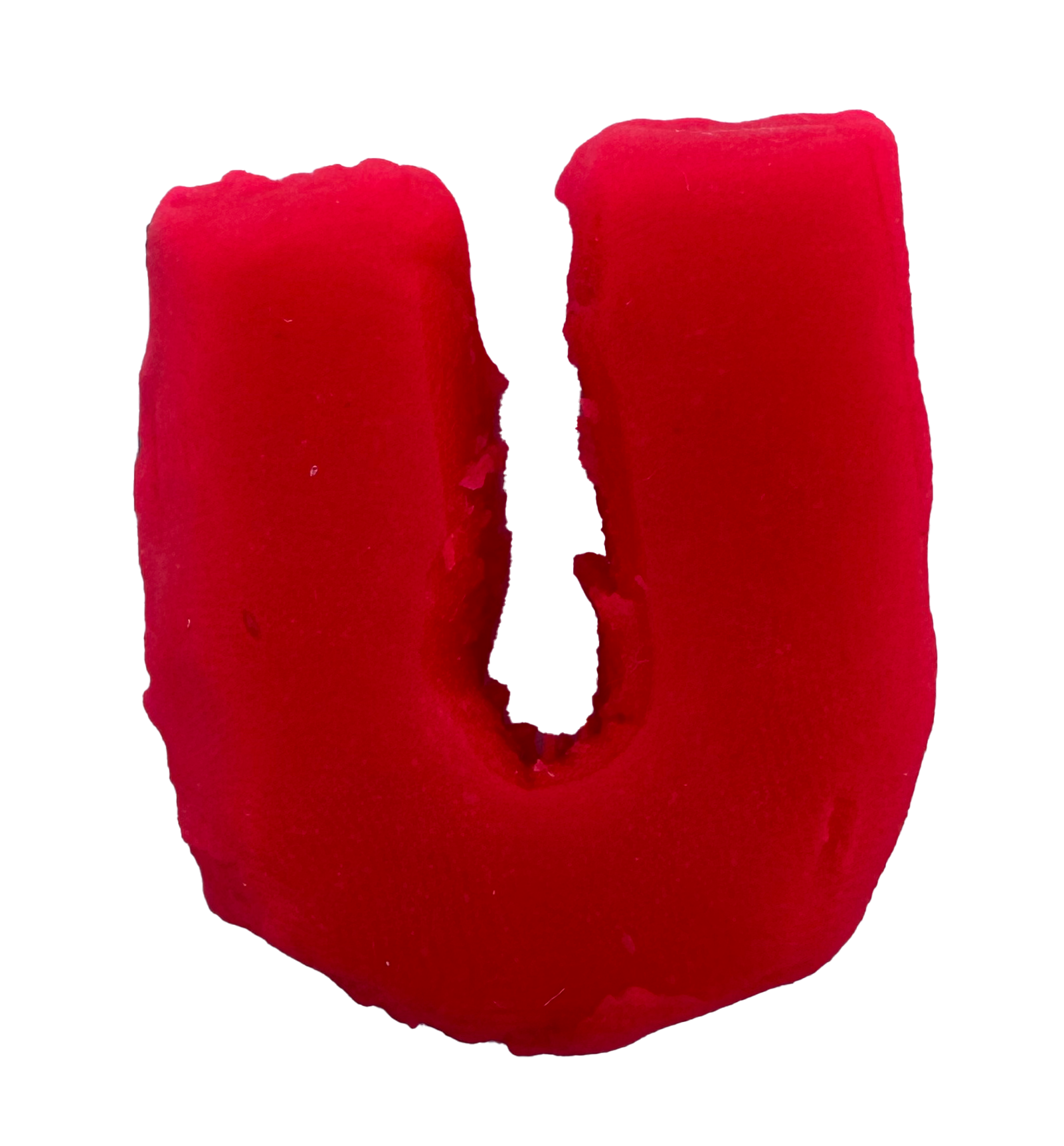
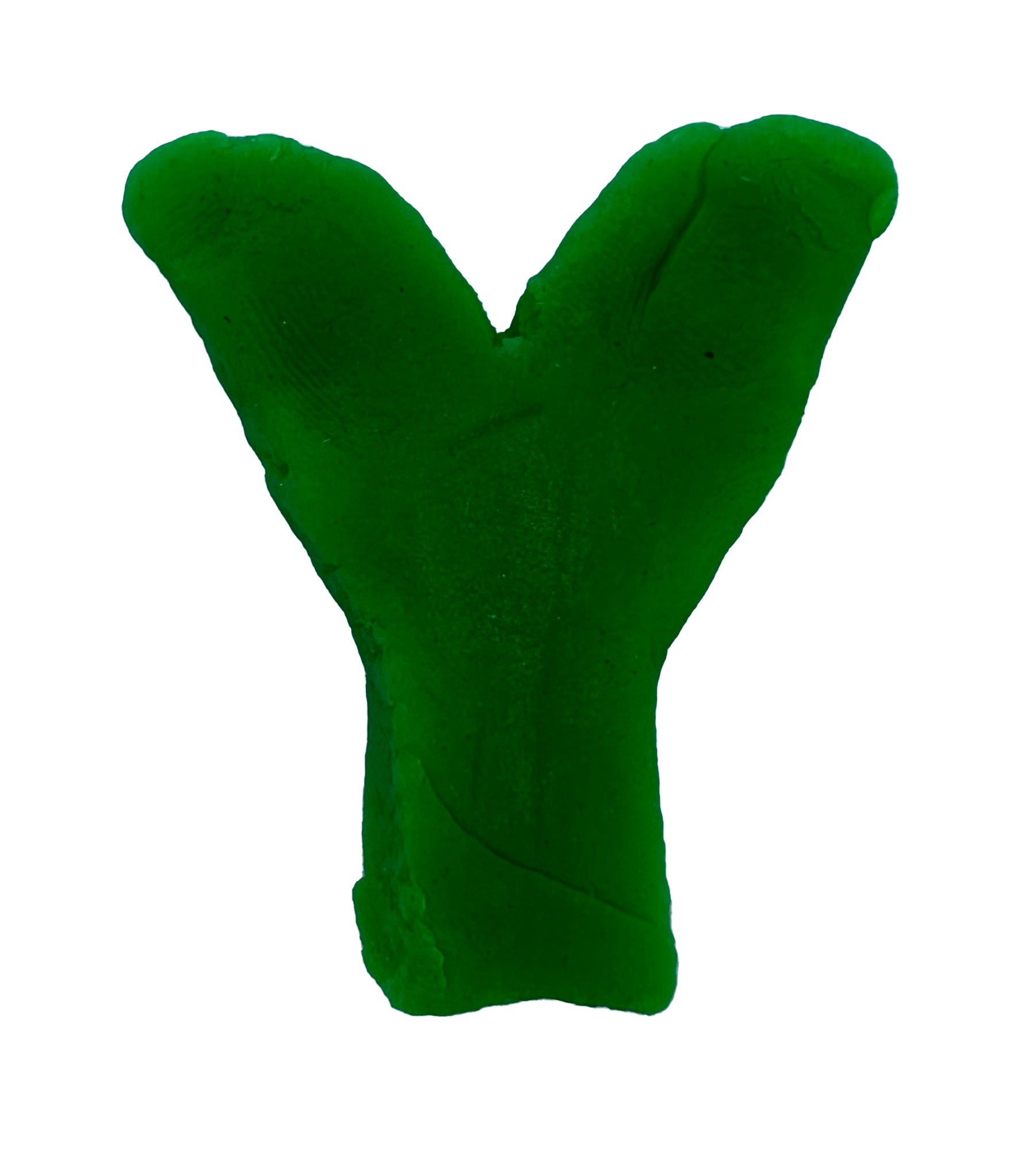
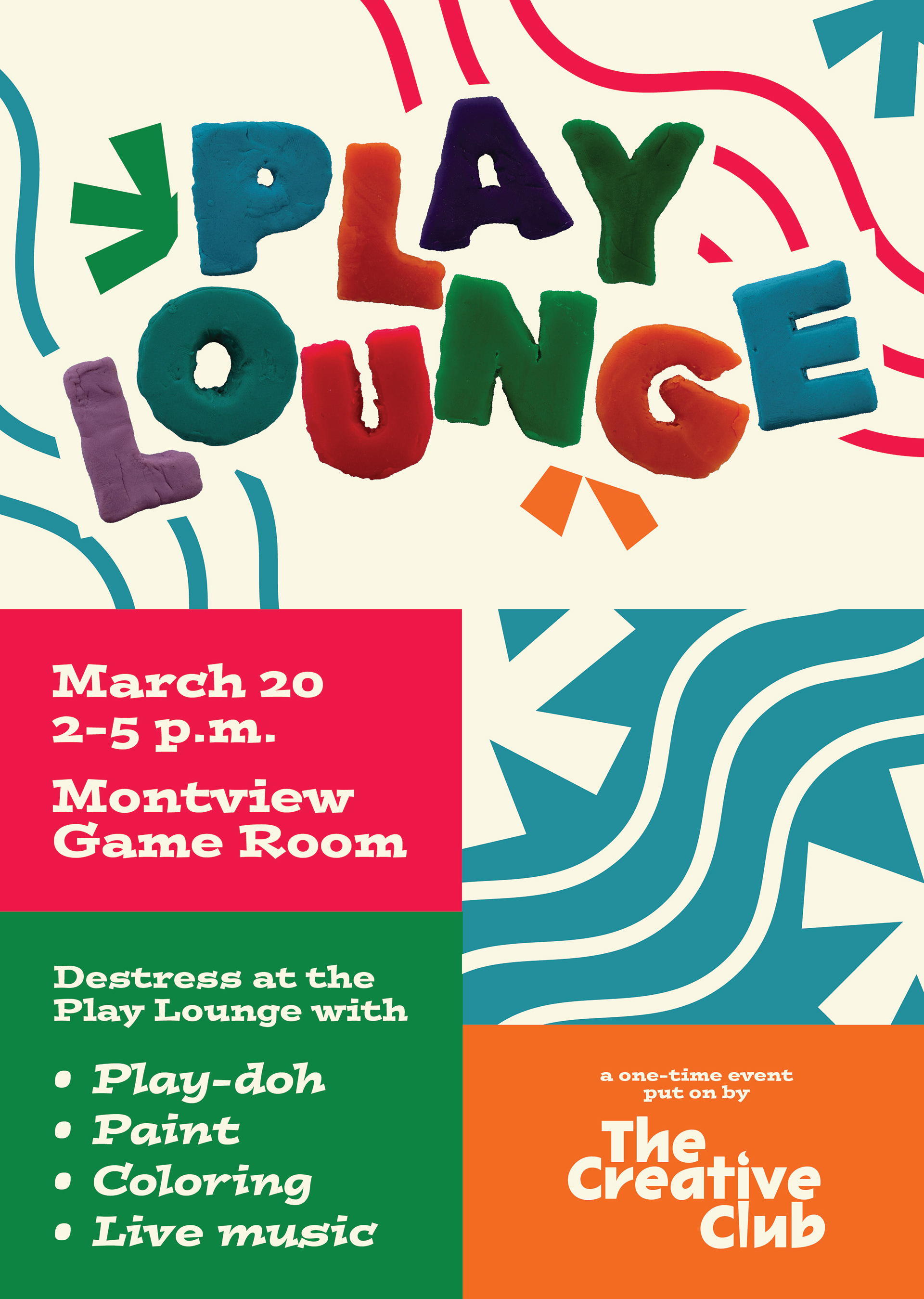
I decided to shift my project idea to a simpler, but still well-executed design using Play-Doh. Using the resin molds originally made for the ice project, I decided to take those and use them as stencils for the Play-Doh. I played around with how I could rearrange the letters into a name for an event focused on destressing through art for college students. I figured out pretty quickly I could create "Play Lounge" if I created a "Y" stencil myself.
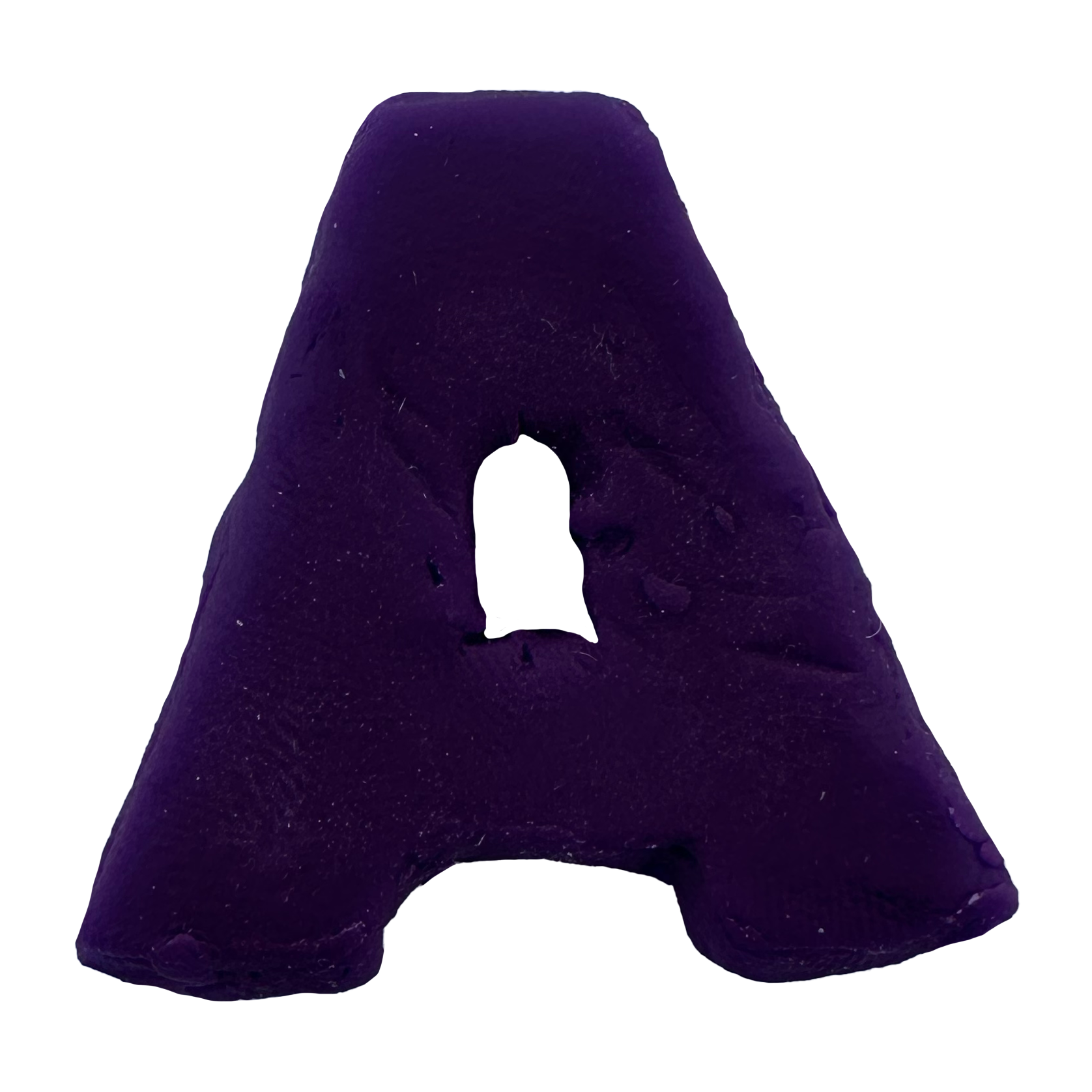
Then, I got to work cutting the Play-Doh out with a toothpick. I would’ve used a knife or something else serrated, but I still wanted the cuts to look a little messy. My poster idea had a playful theme, and I wanted it to still read as Play-Doh from a distance since the surface is not very textured. For the flyer, I used slightly desaturated colors than the Play-Doh to make the title pop. By using a funky and irregularly fun font matched with the flower/star icon I made and the curvy lines running through, the emotion of the piece could be clearly ascertained. After a rough draft of my poster was critiqued in class, I finalized the flyer by creating a stronger hierarchy and resizing the artboard slightly.
FLYER & MOCKUP

PROCESS